This is the API Reference for
light-desk, to understand
what this project is about, and get started, please visit the documentation
homepage.
Each of the components that you can use from light-desk is exported from and
directly accessible via the main module:
const lightDesk = require('@synesthesia-project/light-desk');

const button = new lightDesk.Button(/* ... */);
const group = new lightDesk.Group(/* ... */);
const label = new lightDesk.Label(/* ... */);
// etc...
Components
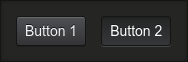
Button
A simple component that can be "pressed" to trigger things.
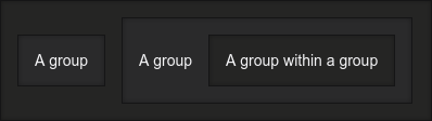
Group
A collection of components, grouped in either a row or column. Can contain further groups as children to organize components however you wish, and have a number of styling options (such as removing the border).
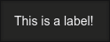
Label
A simple text component. Could be used to label components in a desk, or for more dynamic purposes such as displaying the status of something.
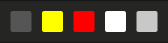
Rect
A simple rectangle component. Could be used for example to indicate certain states, or represent the color of certain lights or fixtures, or perhaps colours used in a chase.
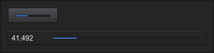
SliderButton
A button that when "pressed" or "touched" expands to reveal a slider that allows you to change the numeric value of something (between some maximum and minimum that you define). Could be used for example: for dimmers, or DMX values.
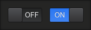
Switch
A component that allows you to switch between an "on" and "off" state.